DESIGNERS BEAT DEPRESSION!
I thought that the WPA, or Work Progress Administration, advertisements were a good idea. Good job FDR and his New Deal. I remember my historyyy and it actually relates to graphic design! But I don't think that the US really gave much thought to the arts. I mean really... was FDR all, "Ohhh let's give these artists a job and then maybe, juuust maybe, our unemployed will get out of the Depression!"
Nah. It went more like, "Let's use these artists for our benefit, to advertise these projects for the unemployed of the Depression." But what goes around comes around!!! So everyone benefits even if it wasn't exactly foreseen by the administration. Ha! You silly administrators overlooking the well being of the arts!(as usual!) I'm in doubt that the artists were taken into much consideration even if the WPA advertisements were to put people back to work. I think it just sorta happened. That's what it looks like anyhow. As with calendars! I don't think the government set out the need for calendars to be made. Definitely one of the creative artists looking for work decided it'll be the next cool, useful thing to do...
Which makes me wonder, since times of the Depression were rough, was inspiration a bit low? Or was this actually the height of creative spark? When artists decide what is the new and what is the old? I guess I could answer that myself now that I think about it... since the Victorian aesthetic changed into a modern aesthetic well during the Depression.
So the Depression actually enhanced artistic change. Art became more useful, such as ads or promotion, which means that not only were these early designs memorable, but they were also useful! And Depression needs useful! It didn't really hit me until now. That without the artists, who would've saved the unemployed?? FDR couldn't have done it without our creative minds! HEY, there's a point for all of this: ARTISTS ARE PART OF EVERY MOVEMENT. AND WE SHOULD BE DAMN PROUD :)
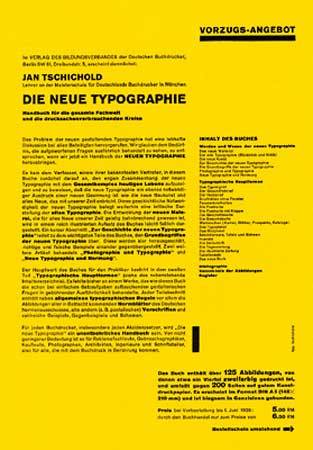
review--------
1919-1933 Bauhaus
Weimar... start. 1st public exhibition:1923
Dessau... golden years
Berlin... end.
Paul Klee
Moholy Nagy
Johannes Itten
Herbert Bayer
Kandinsky
Mies Van der Rohe
Walter Groupus
Oscar Schlemmer
Joseph Albers
Utopian desire to create a new spiritual society.
Unity of Artists and Craftsmen to build the future.
Ideas from all of the Advanced art and design movements were explored and applied to functional design.
typophoto
photogram
photoplastic
no capitals... two alphabets, it makes no sense.
----------------
Models of teaching... strict vs open.


Addison Dewigins. abstract compositions, limited palette.

Lester Beall. Modern aesthetic.... lots of arrows, bars, and rules. More of his work... used in ads during the Depression:
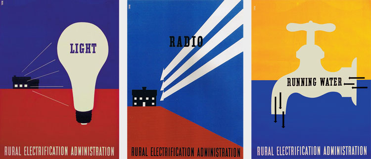 WPA ADS
container corporation of America... cardboard boxes. Herbert Matter.
Ladislav sutnar, 1934.
International Style... modern design. universal truths, pure, clean, efficient works.
No comments:
Post a Comment