More than grids! I love grids and appreciate grids... it was interesting that you shed light that others without a design background maybe might not appreciate design as much. And I was thinking about it... that perhaps you're right on this. I don't remember appreciating the simple works when I was less design-y, but then again, I was always pretty strict and OCD with lining up things and having everything plain and neat. I just didn't realize that this was partially design. Until later that is. So it's all art... whether fine art or graphic design. I agree with Paul Rand with this. It is hard to distinguish between the both. And to come to think of it... renown graphic designers of the day work like fine artists, even considering themselves fine artists.
---
Swiss design(the international typographic style). it's more than just the grids!
Swiss design is... visual unity achieved through asymmetrical organization, objective photography, sans-serif type, flush right, mathematical grids, socially useful (constructivism).
More important than the appearance, is the attitude!
Design is as a socially useful and important activity!
De Stijl, the Bauhaus, and new typography.
Max Bill and Theo Balmer, students of the Bauhaus. grid rules can become the art. math and geometry. like peter berhens. Semiotics are what things mean in relationship to other things.
Semiotics are the philosophical theory of signs and symbols – what things mean in relationship to other things.
Syntactics – order
Semantics – meaning or referred to
Pragmatics – how it's used
Adrian Frutiger... typeface designer. He made Univers. 3 yrs to complete. has a numbering system. 55 is always the base. Also made Serifa, Frutiger, Neue Frutiger, etc.
Armin Hoffman... he helps found the Bozle School... the archetype of Swiss design. relationship between contrasting elements. form vs counterform. "If you design the negative space, the rest works."
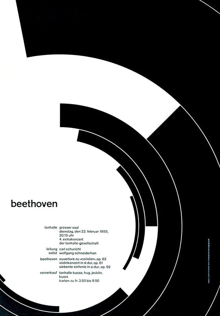
Josef Müller-Brockmann...
Communicates less noise. noise pollution. He uses the same grid for radically different posters. A good grid is liberating.

strong horizontal and vertical
^ I love this poster.
Paul Rand... IBM, Yale, UPS, hand-done aesthetics.

Ivan Chermayeff...

David Carson...


No comments:
Post a Comment