Tuesday, April 5, 2011

American Bauhaus & International Style

DESIGNERS BEAT DEPRESSION!
          I thought that the WPA, or Work Progress Administration, advertisements were a good idea. Good job FDR and his New Deal. I remember my historyyy and it actually relates to graphic design! But I don't think that the US really gave much thought to the arts. I mean really... was FDR all, "Ohhh let's give these artists a job and then maybe, juuust maybe, our unemployed will get out of the Depression!"
          Nah. It went more like, "Let's use these artists for our benefit, to advertise these projects for the unemployed of the Depression." But what goes around comes around!!! So everyone benefits even if it wasn't exactly foreseen by the administration. Ha! You silly administrators overlooking the well being of the arts!(as usual!) I'm in doubt that the artists were taken into much consideration even if the WPA advertisements were to put people back to work. I think it just sorta happened. That's what it looks like anyhow. As with calendars! I don't think the government set out the need for calendars to be made. Definitely one of the creative artists looking for work decided it'll be the next cool, useful thing to do...
         Which makes me wonder, since times of the Depression were rough, was inspiration a bit low? Or was this actually the height of creative spark? When artists decide what is the new and what is the old? I guess I could answer that myself now that I think about it... since the Victorian aesthetic changed into a modern aesthetic well during the Depression.
         So the Depression actually enhanced artistic change. Art became more useful, such as ads or promotion, which means that not only were these early designs memorable, but they were also useful! And Depression needs useful! It didn't really hit me until now. That without the artists, who would've saved the unemployed?? FDR couldn't have done it without our creative minds! HEY, there's a point for all of this: ARTISTS ARE PART OF EVERY MOVEMENT. AND WE SHOULD BE DAMN PROUD :)


review--------
1919-1933 Bauhaus

Weimar... start. 1st public exhibition:1923
Dessau... golden years
Berlin... end.


Paul Klee
Moholy Nagy
Johannes Itten
Herbert Bayer
Kandinsky
Mies Van der Rohe
Walter Groupus
Oscar Schlemmer
Joseph Albers

Utopian desire to create a new spiritual society.
Unity of Artists and Craftsmen to build the future.
Ideas from all of the Advanced art and design movements were explored and applied to functional design.

typophoto
photogram
photoplastic

no capitals... two alphabets, it makes no sense. 

----------------
Models of teaching... strict vs open.


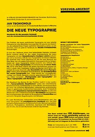
Jan Tschichold. hand lettered AD. son of designer & painter... learns calligraphy as child. Work is like Lissitzky, but with type instead of rectangles. Writes book about typography... The New Typography. The aim of every typographic work is to... form follows function: practical. Modernism. sans serif, limited color, underlying grid.

Jan Tschichold


Herbert Matter. All roads lead to Switzerland poster. The modern poster. Extreme perspective and scale shifts. Precise and efficient. Brings his style to America

Addison Dewigins. abstract compositions, limited palette.


Lester Beall. Modern aesthetic.... lots of arrows, bars, and rules. More of his work... used in ads during the Depression:
WPA ADS

container corporation of America... cardboard boxes. Herbert Matter.

Ladislav sutnar, 1934. 

International Style... modern design. universal truths, pure, clean, efficient works.

Tuesday, March 29, 2011

Bauhaus

So I was close! I knew the Bauhaus was a school and a thought... in the movie they said it was literally the "building house", which makes sense... both because the school in an architectural place and a school that is building/teaching. Speaking of teaching, I want to learn German now... I could understand some of it surprisingly. Back to the Bauhaus, I really felt for the students being moved around. Did the students follow the school or once the school left? Or were they stuck to go to another school or quit art school completely. I'd image there would be other schools around, but most likely the way the school thought was different. I couldn't imagine myself following a school that moved around a lot. Were the students just left in the dust? "Good-bye students. We have to move now. The Nazis are coming. Sorry?" No wonder the students rioted. I would have.


Bauhaus 1919-1933
open for only 14yrs. 1250 students. not many students...
basis of design education
Walter Gropius. 1st director of the Bauhaus, 1919-1928. return to arts and crafts... go back to the old ways. Published the... used a cathedral to represent PAINTING, SCULPTURE, and ARCHITECTURE. A social unity. All should be equally valued as one. Used cathedral like John Ruskin. utopian ideals are important. 

COUNCIL OF MASTERS
Gropius is headmaster
Gerhard Marks...sculpture/pottery shop
Lyonel Feringer... painting
Johannes Itten... head of design. foundation program. leaves Bauhaus in 1923, during the first Bauhaus exhibition. Shift to design thinking, straying away from arts and craft.

core foundation program, analysis of old masters work. create abstract things out of trash/rubbish. hard contrast with soft. contrast, contrast, contrast!
cubisim, De Stijl. SHIFT OF THOUGHT IN THE BAUHAUS. ART & TECHNOLOGY: A NEW UNITY.

László Moholy-Nagy: Hungarian constructivist. worked with resin, photomontague, and....
typo-photo. he sees photography is going to take over painting. new visual language for a new age. photogram.... where the shadow is, it turns white. photo-plastic...photomontage: collage of photos.

Bauhaus made in industrial area. move in 1926. to Dessau, Germany. student designs in catalogues. made in the Dessau industrial city.

the universal alphabet... doing away with serifs and capitals. flushing to the right. hierarchy and contrast. explored strong horizontals and verticals in their compositions. Dominate horizontals and verticals. 
Viec Monroe "Less is More."

The Bauhaus

All I know about the Bauhaus is that it's a style and school. That's all... let's learn!

Tuesday, March 15, 2011

Avant Garde in Russia

Piet Mondrian's tree studies over time experimenting with the latest art movement got me inspired to do the same... it's a good idea and it shows the artists' change of style. It's as if the artist is going through time.
Avant garde in Russia
El Lissitzky... constructionism: art has meaning for state, authority, etc. Practical application. 
photomontage... the modern way of making art. 
montage in cinema... film The Battleship Potemkin. 
Eisentein's Potemkin
Alexander Rodchenko: to go constructivist for design! Creating something for the people, you have moral good.
bars used as graphic elements, with collage, overprinting. generous space.
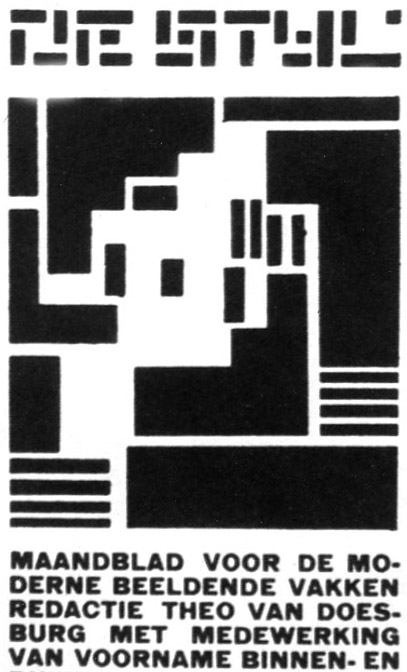
De Stijl... movement developed in the Netherlands. Utopian approach to aesthetics. utopian society with FUNCTIONAL art. communication design. rectalinial planes, void of surface textures/decorations. no trees, cows, illustration. pure hue color. mathematical structure. universal harmony to use in art. 
Piet Mondrian
Founder of De Stijl: Theo van Deoesburg. Asymmetrical design... universal structures, asymmetrical balance. Data Poems. 

Tuesday, March 1, 2011

Isims & Depressing Movie

Depressing movie...*ORGAN* suprematism... Malevich. Revolution. Advent Guard art. Individuality in art not allowed. Socialist Realism was the only art accepted by communists. All the Cubism and suprematism stuff was hidden away... don't remember anymore...Hitler says that art needs to be understood by the Proletariat(common man and worker). In the times of the proletariat, maybe the art was understood, but honestly, I doubt it was fully understood until later.

Bauhaus 1919-1933

isims

illustrations, romantic. Allies powers.

reductive, sophisticated. Axis powers.
Hohlwein's work recognizable with stamp mark that looks like a Z. 1914. reductive form. figure downplay with figure's hat and background Red Cross. emotional appeal to donate to the Red Cross. 1936, winged figure souring through sky over the olympic flag. Stencil reductive form. 
Hitler propaganda says the allies posters were superior... ironic because axis was more superior.
Germany Und du? And you? Masculine poster
Hohlwein's work is tainted because he worked to Axis side.

1918, Edward McKnight Kauffer. ideas of cubism applied to communication design(like the cube-like birds and women & rain with umbrella) generous use of negative space. cubism.

Georges Braque and Pablo Picasso.... cubism. analytical cubism = beginning. synthetic cubism= later, the collages.

1925 Adolphe Mouron Cassandre....language of abstraction. telegraph poles, structure. The telegraph
pictorial posters. north star, paris to amsterdam poster. white star and train track. Pullman car poster. graphically interesting. 
3248947556_3650ec8168_o
ship is a rectangle, little tugboat. 
Dubonnet poster. The type words work with the art so well. It has greater meaning.
Train bar poster. Picture of train wheel, cubism bar items on top.

Russian Avent guard. 
Cubo-Futurism, suprematism, constructivism. 

Bala's dog. little dog, movement. 

Kazimir Malevich. Motion, cubism. Cubo-Futurism. Black Square and Suprematism Composition dude. suprematism.

cut paste, hand-done stuff.
Suprematism. Color & Emotion. primary elements. rejects pictorial. no narrative, just feeling. black square idea, red square. 1915.

Constructivism. Function is meaningful art according to constructivism. Vladimir Tatin. Rodchenko. El Lissitzky. Art should serve the new communist society.

abstract painting.... Kandinsky.

El Lissitzky. proum, an acronym. building. intersections, spacial, illusions. Beat the whites with the red wedge. Bolshevik is the red wedge. Conservatives is the white. 

The Isms of art... attempts to decode all of the isms. German, French, and English separated with big thick black bars. Grid system layout. Modern aesthetic. sans-serif typography. 

Tuesday, February 22, 2011

Film, Peter Behrens... etc.


* { So that film in class today talked about how the West progressed through new technological advancements and there was a lot of politics involved. Lots of US history class stuff was talked about like good o president Teddy aka Theodore Roosevelt. And then there was Taft. There was talk about the coal mines and suppression of foreigners. Film was touched upon briefly as well as other inventions. Medicine slightly improved and people started to band together for better pay and work environment. Also touched upon was how in the west, rodeo was a form of entertainment while in the north, betting or the fair rides like at Coney Island were popular forms of entertainment. Basically people got wealthier and had more money to spend on other commodities. Progress boomed and it seems just as an exciting time to live in as today (maybe even more exciting the way things went so fast). The discoveries made then influence us today just as art from the past influences art in the future. Everything in a sense was once modern. What is more modern than modern is postmodern and what is more modern than postmodern is post-postmodern. What's next? New Modern or Post Modern^3? I guess this film got me thinking about the future. It went so fast then, discoveries all over the place, that we should be doing the same now. Because we're in the moment, we might not see it exactly as so. We're not in a drought of new discoveries or ideas. At least, I don't believe so. In any case, what isn't defined now shall be defined and influenced from the prior discoveries, new art, inventions, law, and what-not. No problemo. We'll just keep on going like the energizer bunny~ }

* Notes {
-AIGA Founded in 1914

Quality craftsmanship. Glasgow school- rectalineal

harmony of proportion and weight. geometrical and lyrical. like stained glass

Joseph Hoffman- flat pattern work. developed aesthetic. 

flat panels. abstraction. negative space becomes form.

the first usage of sans serif running text- Peter Behrens. credited for creating the first comprehensive identity program: typeface and layout system. non-load bearing walls. has a close connection to Mies Vanderrohe and Walter Gropeous
Art Deco.. closed forms, rectalineal, flat.
uses folio elements (elements on page w/text) in deco form
1919 Bahaus opens.
Square and circle grids. proportion basis. 
Honeycomb metaphor for the AEG logo. He developed typeface and consistent layout... branding. first guy to create the first comprehensive identity program.
Influenced by Morris. consistent layout and structure... applied to everything he did. good grid system that is flexible and used for many things he did. 
designed a turbine hall (to generate electricity). form follows function... modernist idea. 

plaketstil - poster style.  "plaket"-poster. "stil"- style. Mr. Bernhard. (recognizable rectangular logo with his name on his works)

AXIS POWERS PROPAGANDA POSTERS
Graphic, abstract, and sophisticated. Must have understanding of context. 
u-boat, submarine enlisting poster. communication simplified. decode aesthetic. 
Julius Klinger poster killing serpent... bond drive (WWI investment drive). abstract and complex meaning.
RAF Royal Airforce. Falcon- German symbol, bird of prey grasping the RAF(target symbol)

THE ALLIES PROPAGANDA POSTERS
information, illustration, lots of content. have victory gardens, buy bonds, donate to the red cross, symbol of patriotism.
}

Tuesday, February 15, 2011

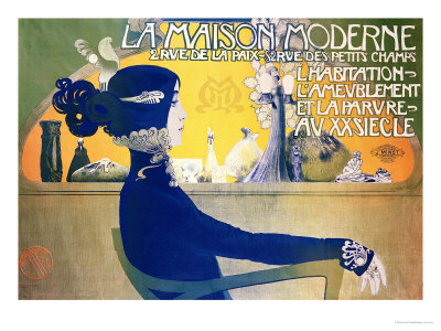
Art Nouveau

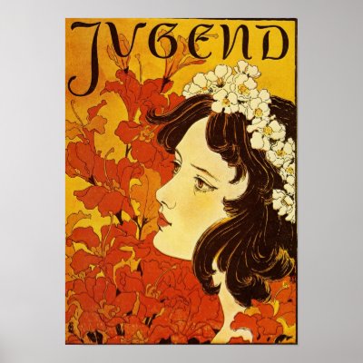
I've always been awed by the Art Nouveau style and actually just finished up a project on contemporary artist David Lance Goines'. His stuff is so art nouveau, but looks more refined than the earlier works that I've seen today. I noticed that the colors of art nouveau are all so similar. The warm colors seemed to dominate all the works and everything was saturated. The simplicity and elegance of line is so fluid.


New Land typeface. pinnacle of German typography. 
The alphabet. Arts and Crafts, returning to the medieval. 

Arts and Crafts goes into Art Nouveau.

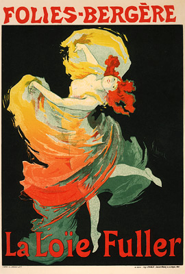
File:Cheret, Jules - La Loie Fuller (pl 73).jpg
Jules Cheret, his work typically has a woman at the center surrounded by activity and the typography. 

Moulin Rouge - La Goulue 1800

E. Grasset: his color book style of art nouveau. the look of woodcut printing but it is lithographic printed.
Arther Machmurdo: quality of line, contrasting.

Hobby Horse: art magazine. the beginning of the art manifestoes. shows British arts and crafts to a broader audience. 
The Studio: 1893. art magazine. shows the works of Aubrey Beardsley. he did full page illustrations. Beardsley put little nymphs in his work.
Aubrey Beardsley did dark stuff. shocking art. interesting use of figure and ground. 

Asian influence in Art Nouveau.

Alphonse Mucha: art nouveau illustrator. Long prints so he could print two side by side in one lithography. Stylized form. flowers, folk art, delicate letters. tile, repeating pattern. tendrils of hair, whiplash hair. boarder elements. exotic design, peacock feathers and exotic lines. 

pattern books
Manuel Orazi-- recognizable art nouveau. 


GE logo made during art nouveau.

Harpers Magazine used the European art nouveau, bringing art nouveau influences into America.
Lois Rhead and Will Bradley are two art nouveau inspired artists in America.

The Inland Printer magazine. flat pattern with flat figures.
photomechanical

Will Bradley merged art nouveau style and medieval style.


Jugenstil- German for youth style


Peter Behrens. Designed the kiss with young people. looks like two girls so it was very controversial.

Margaret and Francis McDonald 
Hurlbert McNare
Charles Rene Macintosh 
^ four art students at the Glasgow school of art. Geometric, curvilineal elements. VERY LONG rectilineal structure. reductive style (becoming abstract)


The Vienna Secession (The Austrian Art Nouveau)
)
Gustav Klimt - the kiss
Josef Hoffmann

Ver sacrum: Sacred Spring. Journal.


Art Nouveau influenced 60s work - the type aesthetic 

Kolman Moser